This typically happens because
- the page has been removed,
- the visitor has clicked a broken link,
- the visitor typed a URL wrong.
This can be a frustrating or confusing experience for the visitor – but by applying some simple rules you can turn that experience into a positive one.
1 – Never blame the visitor
Never blame the visitor for the error. Instead, be apologetic and empathetic.
Consider the words used to avoid the visitor feeling like the error is their fault. Words and phrases like “might have” or “possibly” are less likely to offend.
2 – Say what has happened
All the visitor will know is they’re not seeing what they expected – so the first thing you need to do is say what has happened.
Keeping it simple is REALLY important. The message needs to be short and short using plain simple English, no technical jargon or long explanations.
You may even consider using humour or informal language like “oops!”.
Using the term “404” is not necessary. The average user will not know (or care) what a “404” message is – and it’s not important to them. Just make sure the page returns a 404 header response.
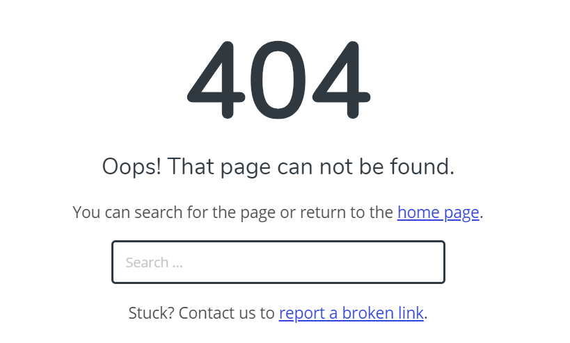
For example: “Oops! That page can not be found.”
3 – Give options for what to do next
Now the visitor knows something has gone wrong, you need to give them options for what to do next.
Ideally you should be trying to help them find the page that they were trying to access.
A simple but effective way to do this is to provide a link to the home page and a search box – this caters for both people that aren’t sure and want to click and those that know what they’re looking for.
You may also want to provide a list of popular content – perhaps you don’t have what they’re looking for but you can provide other great content.
4 – Consistent with design
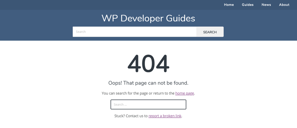
Make sure your 404 page uses the same look and feel as the rest of your site.
This includes:
- colour
- fonts
- images
- menus
- header
- footer.
This will help establish the visitors confidence in the website.
And remember – don’t make users scroll. This is a one-screen design.
5 – Contact and feedback
Provide a way for a visitor to contact you – for example an email address or a contact form.
This allows them to report a broken link – giving you the opportunity to fix it and retain the visitor.
What does this look like?
Here’s how I handle the 404 “page not found” page for this website.
Key features are:
- branding is maintained
- language is short and straight to the point
- there is a link to the home page
- there is a search box
- linked text is at the end of the sentence
- there is the ability to report a broken link
