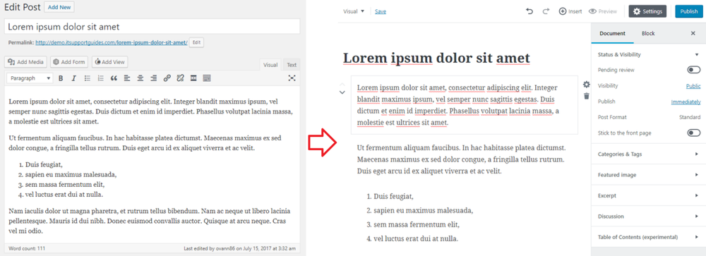
Since early 2017 WordPress developers have been working on a new content editor for WordPress – code name “Gutenberg”.
The intent is to replace the current content editor, TinyMCE, but for the meanwhile Gutenberg is a plugin in it’s beta development phase.
Gutenberg is attempting to completely reinvent how editors interact with content – most significantly:
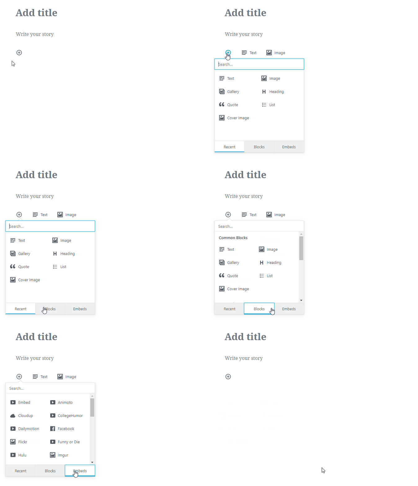
- separating the parts of content into “blocks” – for example, paragraphs, lists and images will all be separate blocks. A concept that has remained in desktop word processors, such as Microsoft Word, since their invention
- providing a minimalist interface which only provides buttons contextually when they can be used.
The good
I can understand the desire to be innovative and provide improvements – in fact, I applaud it.
The current editor, TinyMCE, was introduced to WordPress in version 2.0 in 26 December 2005.
Since then it’s seen several updates but has remained a traditional WYSIWYG content editor – one large block for all content, buttons at the top, ‘visual’ and ‘code’ mode etc.
During the same time other areas of WordPress have changed significantly – leaving the perception that the content editing experience also needs a revamp.
I’m not convinced that a revamp of this scale is necessary – specifically separating content into to blocks.
But to be fair I do see one benefit – it will pave the way for developers to provide “block plugins”, much like WordPress widgets but for content. For example, you could create a button or an AdSense unit exactly where you want in the content with a few clicks of the mouse.
The bad
Change can be good – but it needs to be tested and refined based on feedback.
I’m concerned that Gutenberg went too far before user testing and now even after user testing is revealing its faults the ship has already sail.
Developers tend to have a “build to improve” mindset – an unwillingness, or inability to accept some features are not good and will focus on building on the feature when sometimes you just need to accept that some faults are not fixable, or at least not with code.
Just take a look at the Gutenberg reviews – at the time of writing there are 38 1 star reviews, compared to 15 5 star reviews.
Will the developers listen to this feedback? Will they refocus on the usability and functionality shortfalls? Or will they just focus on the technical implementation?
The ugly
The truth is – the Gutenberg plugin leaves a lot of room for improvement.
By removing all the traditional editor buttons and trying to make a minimalist design the usefulness and ease of use has been drastically reduced.
Extra clicks
Using Gutenberg I found myself to click, hover and look for the buttons – instead of them being visible and available immediately.
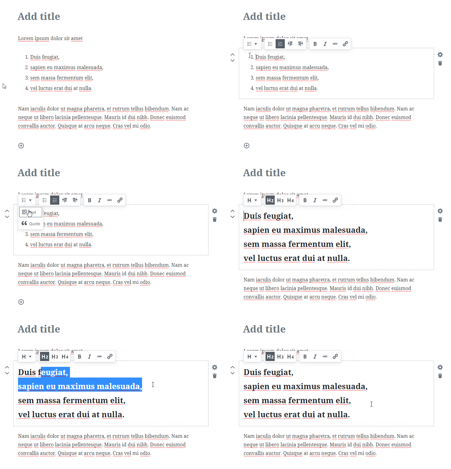
I accept that once you learn a new user interface you things get quicker – but even after learning how to change a heading to a list it still took 8 seconds in Gutenberg, compared to 2 seconds in TinyMCE.

Failing to recognise vastly different WordPress uses
I feel like it fails to recognise the vastly different ways WordPress is being used to manage the different types and formatting of content.
For example, I manage a how-to blog. Listed items (UL or UL) and pictures are fundamental to providing how-to-instructions. But with Gutenberg even this very basic requirement is not possible – to add an image you need to end the list, insert the image then start a new list – returning the list back to 1.
Clunky reformatting
In content creation I often reformat text, for example changing listed items to headings or switching an H2 to an H3 to create a better structure. Gutenberg did not handle this well at all. Turning a list to headings created some hideous heading block with <br>’s (not that I can check due to the lack of a “Source” option).
Learning curve
The platform may be web/browser – but the end users are used to desktop word processors and will be expecting a similar user experience when trying to use HTML WYSIWYG editors.
If the usability testing has said anything – it’s that there will be a lot of end user support and hand holding to train non-technical users in how to steer it. Not something I’m particularly keen to spend time on.
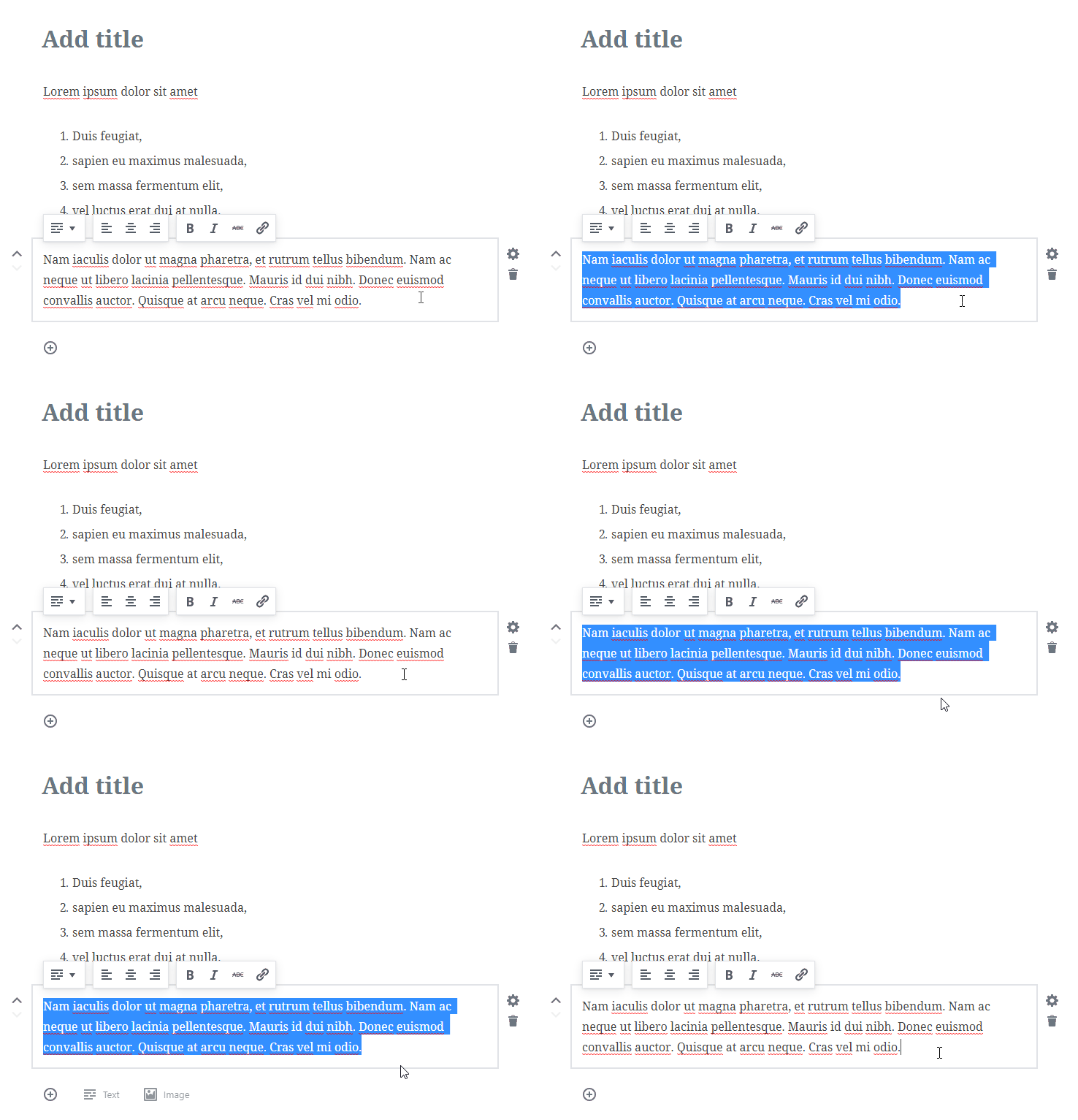
For example, select-all – this should select EVERYTHING in the document — not just the current content block.
No source view
For the more HTML literate users – the lack of a “Source” option to view and manually change the HTML will be significant. If you’ve ever needed to paste content in HTML format into a post, add custom formatting, edit/clean HTML – you’ll be at a complete loss with Gutenberg.
Third-party TinyMCE
Some people have argued that there will always be third-party plugins to re-introduce TinyMCE.
But I don’t think this is enough – the content editor needs to be a consistent user experience for ALL WordPress users and MUST have core support.
Conclusion
I acknowledge that Gutenberg is still in beta, and that the developers have put a lot of work into getting it to where it is now.
But I find it hard to see the Gutenberg editor providing an easier experience for any content management scenario I’ve dealt with.
I feel like they’re trying to solve a problem that just doesn’t exist, not at least for the majority of users. To me it seems like there are enough solutions like TinyMCE and CKEditor to not justify recreating an entirely new editor and new editor experience.


