When working on graphic design projects an important step is choosing the colour scheme. Successful colors schemes are chosen to support the goals of a site, to help communicate a message, feeling or emotion of the product. While there is more to making a successful graphic design product, knowing how to create a harmonious color scheme is one of the key elements that must be utilised. The following information is provided to help you understand how the colours interact with each other and how you can take advantage of this.
The Colour Wheel
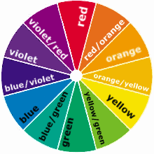
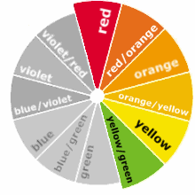
A colour wheel is used to represent the spectrum of visible colours, it identifies color families and how they relate. After selecting a scheme with a colour wheel you can modify the tone, values or saturation to make the colours more appropriate for the design project.
Warm and Cool Colours
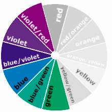
At each end of the colour wheel you have the ‘warm’ and ‘cool’ colours.
Warm colours like red, orange and yellow can be used when you want your design to be warm, cozy, inviting, natural, “homey”, or related to the autumn season.
Cool colours like violet, blue and green can be used when you want the design to be processional, unemotional, sterile, or related to the winter season.
Monochromatic Colours
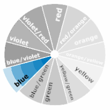
Monochromatic colours are colours with the same hue but different tones, values and saturation. They can be used when you want your design to be very harmonious colours, to be calm and orderly, or to have a ‘theme’ colour. Monochromatic designs work particularly well when you need a professional design which doesn’t steal focus from the content, for example a photography blog or a shopping cart website.
Complentary Colours
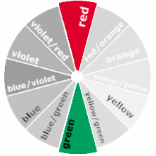
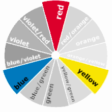
Selecting colors opposite each other on the color wheel creates a scheme of complementary colors. Whilst this is the most simplistic method for selecting colours, it can be quite successful at communicating a energetic feel which particularly appeals to children.
Complementary colours will give your design a strong visual impact, to clash, to be extreme, and be exciting.
Split complementary (Triadic) Colours
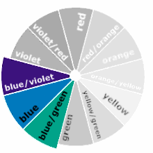
The triad approach to selecting a colour scheme involves selecting three colours which are evenly separated, forming a triangle. These colour schemes will give your design a strong visual impact, be bold or exciting, or quite colourful. Designs with these schemes have a sense of harmony whilst still providing a lively and exciting feel.
Related (Analogous) Colours
Selecting colors adjacent to one another on the color wheel creates a scheme of analogous colors. This type of colour scheme can be used when you want your design to be harmonious, conservative, restful, calm or business-like. Examples of analogous themes are readily present in nature, from the blue-greens of the ocean to the red-browns of natural timber.
Colours as Emotions
Whilst colour representing emotion isn’t a very certain practice, it’s still important for trying to position your audience for the purpose of the design project. The following list can be used as a guide for how each colour might be felt by your audience.
| Colour | Emotions | |
| Red | Strength, danger, war, power, courage, confidence, passion, and love | |
| Yellow | Happiness, intellect, and joy | |
| Blue | Stability, loyalty, wisdom, truth, trust and confidence | |
| Green | Fertility,life, nature, natural, and growth. | |
| Violet | Royalty, luxury, power, ambition, magic, and mystery | |
| Black | Elegance, evil, death, authority | |
| White | Simplicity, purity |
