Accessibility means providing flexibility to accommodate each user’s needs and preferences. In an Internet context, accessibility is making computer technology and Internet resources useful to more people than would otherwise be the case.
Table of contents
Internet Accessibility is normally aimed at allowing for the participation of people with disabilities. Internet accessibility can also include consideration for people whose communication infrastructures or capabilities are not advanced or not in place.
The following information covers a range of scenarios …
Blind users
Computer users with very limited or no vision access the information on the computer by using a ‘screen reader’ like JAWS – more about JAWS. The first thing to know when it comes to blind users is they don’t use a mouse as they can’t visually track the mouse cursor, this leaves blind users completely reliant on using the keyboard as a means of navigation.
How can we ensure our website is accessible for blind users?
- Test your website – there a few options, getting an assistive technology specialist to test your website, learn how to use a screen reader application and test the site yourself or use an application called WebbIE. Whilst WebbIE wasn’t strictly designed for this purpose, it displays your website in clear text exactly like a screen reader would. More about WebbIE
- Screen readers read from the HTML, from the top to the bottom. This is important when it comes to how the HTML body is structured. Make sure the information is linaer, e.g. Website title, page title, main menu, contents, contact details.
- Use CSS to separate content from design – this includes everything that isn’t the content information, e.g. background images, small icons, font styles, colours etc.
- Don’t have information inside of flash objects – whilst these might look pretty, they are completely inaccessible. If it is absolutely necessary to do this you could provide a separate link for an HTML version OR have the information hidden behind the flash object or far away from the displayed text, this way the screen reader will read the text and the sighted users won’t be able to see what’s hidden.
Partially/poor sighted users
Partially sighted or poor sighted users have a limited amount of vision, depending on the level of their vision they might customise their display settings to enlarge fonts, buttons, windows etc OR use a screen magnification program like ZoomText –more about ZoomText.
Unlike a blind user, partially sighted users get most of the information visually. This allows them to easily access any website, but there are a few considerations that are worth noting,
- Use padding – people with poor vision can become fatigued quickly because they are having to concentrate so hard with focusing on the text, by giving your text padding it becomes easier to follow and read
- Test your site with the browsers text magnification – look for any information that might have been dropped
- Don’t use small fonts – depending on the font used around 12 pixels is normally used
- Use neutral colours for text – a blue background and red text would be difficult for anyone to read
Colour blindness
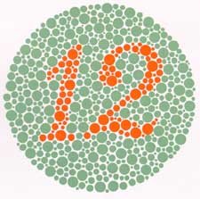
It is estimated that 1 in 12 people have some level of colour blindness – more information, this includes hue, saturation and blindness. To accommodate these users try to avoid light colours for fonts and information that is only communicated through colours (like sections to a website).
Colour blindness test example:

Deaf users
Deaf users are about to access the visual information in the same way a sighted user can. However, if you have information which is only available through audio (including videos) providing transcripts would be giving a deaf user a reasonable way of getting the information.
Keyboard only users
Blind users aren’t the only people that rely on the keyboard as a means of controlling the computer, low vision users might use the keyboard to avoid having to follow the mouse cursor as well as physically impaired people.
The same advice from ‘blind users‘ applies, test your site by only using the keyboard, try to follow some typical tasks that are done on your site.